Rebuilding the design system of a live product.
Role
Timeline
Team
Skills
Overview
Rebuilding the visual foundation without stopping the roadmap.
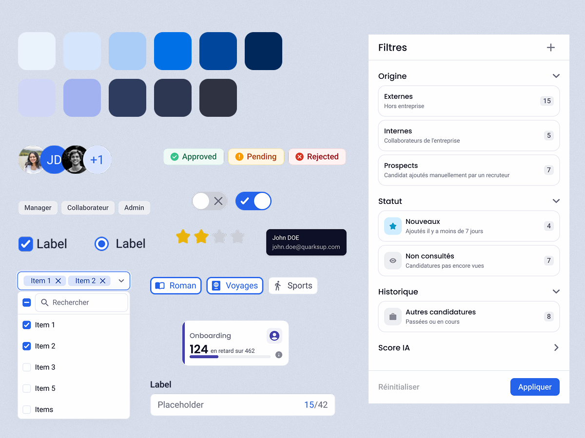
The product had shipped years of features with no visual foundation: no tokens, no documented rules, no shared language between designers and developers. Mission: rebuild the system from audit to rollout, without stopping a live product.
My role
Within a team of 4 designers and 6 developers, I initiated the project and defined the foundations: visual and UI direction, token architecture, component system, and naming conventions. The other designers contributed to component production once the system language was established.
Audit
What the product actually looked like
A system that lived in two people's heads
Two designers, five years, Adobe XD. No documented rules, no maintained library. It worked because both of them remembered everything. When the team started growing, that memory wasn't transferable.
I joined as the first new designer in five years. Finding the right component took longer than using it. I proposed migrating to Figma, bundling a full rebuild and modernization into the transition.
Accessibility
WCAG AA contrast thresholds not met. Focus and hover states absent or inconsistent across most components.
Dated UI
Color palette with no semantic roles. Incomplete dark mode. No shared scale for borders and shadows.
Inconsistency
Multiple designs for the same component across modules. Obsolete components not removed from the library.
No rules
Library not maintained at the product's pace. No usage rules, no component documentation.
Sales and user feedback
"The product looks like 2000s software."
Define
Architecture decisions before any component
Before touching any component, I defined the intervention order. Foundations first, then the library, with migration running in parallel to avoid a big-bang transition.
Foundations
- Token architecture
- Primitives + semantics
- Typography system
- Spacing
- Shadows
Components
- Figma library
- Variants & states
- Documentation
Migration
- Parallel to component builds
- New features on DS from day one
- Legacy screens migrated incrementally
Tokens first, components second
The dev team already had a color structure. Rather than rebuilding it, I extended it: grouped colors that were too similar (deleting them would have broken production components), added values where SaaS patterns needed them, then layered atomic semantic tokens on top in Figma: one per role, not per component.
Color variables in Figma: primitives and semantic tokens
Chosen approach
Atomic semantic tokens in Figma (text, background, border, icon) mapped onto the existing dev color structure. Designers get a shared vocabulary. Developers keep their pipeline unchanged.
Alternative rejected
Component-level tokens (button-background, card-border...) that would have required rearchitecting the dev-side color organization.
Cognitive principle
The right token granularity is the one the team can actually maintain. Extending what exists gives the system traction from day one.
Result
Designers stopped picking raw values by feel. Every color decision in Figma maps to a named role. Dark mode gaps became visible and fixable at the token level.
Build
Building the component library
The live product constraint
Rebuilding components in isolation creates a gap: the system is complete in Figma, but migrating existing screens requires a big-bang switch that disrupts visual continuity for users.
Parallel-track strategy: new features built exclusively on the DS from day one, legacy screens migrated incrementally on a separate track.
Users experienced gradual visual improvement, not a confusing transition. No screen mixed old and new components at the same time.
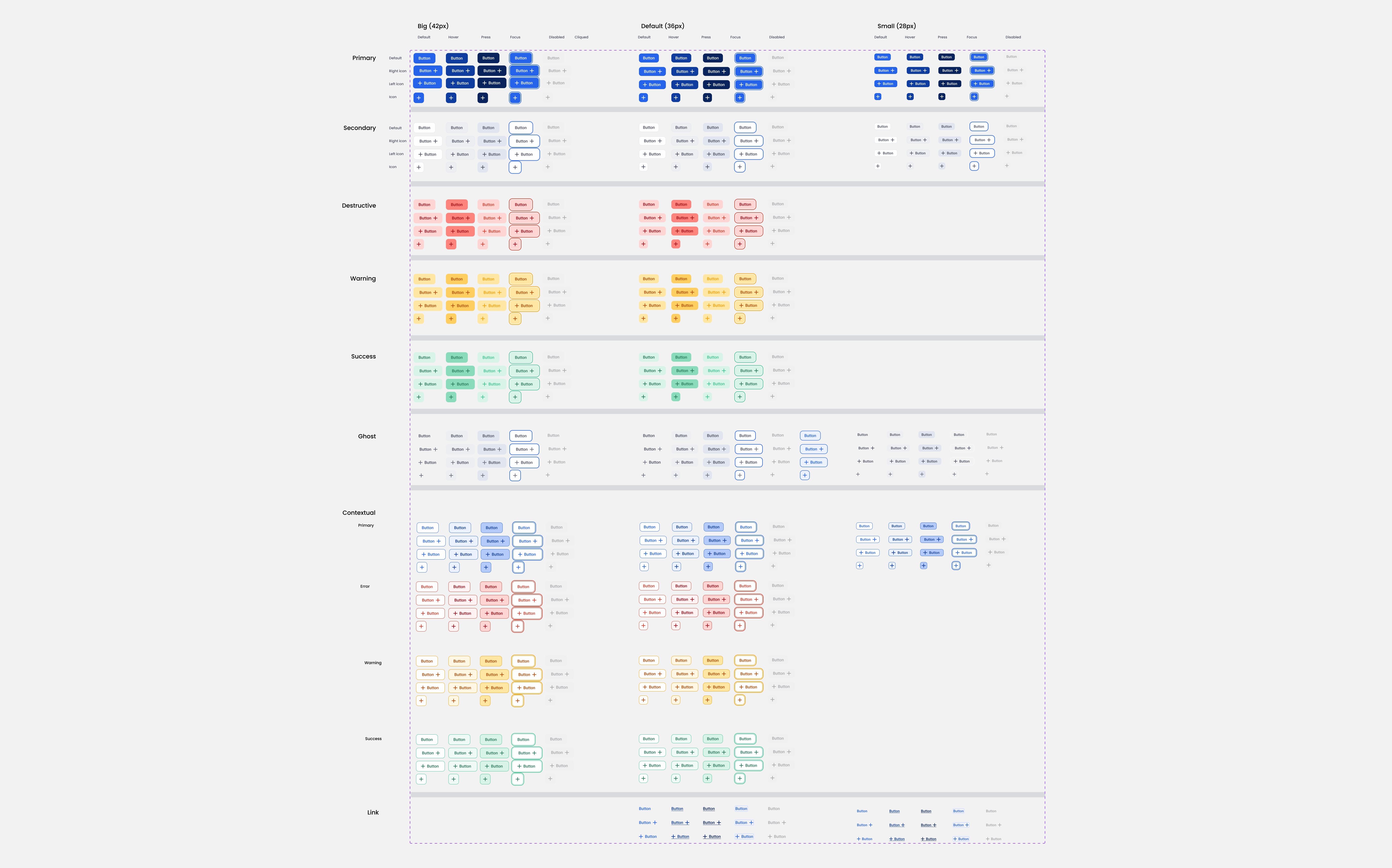
Before: 7 separate components, no defined sizes, several types missing
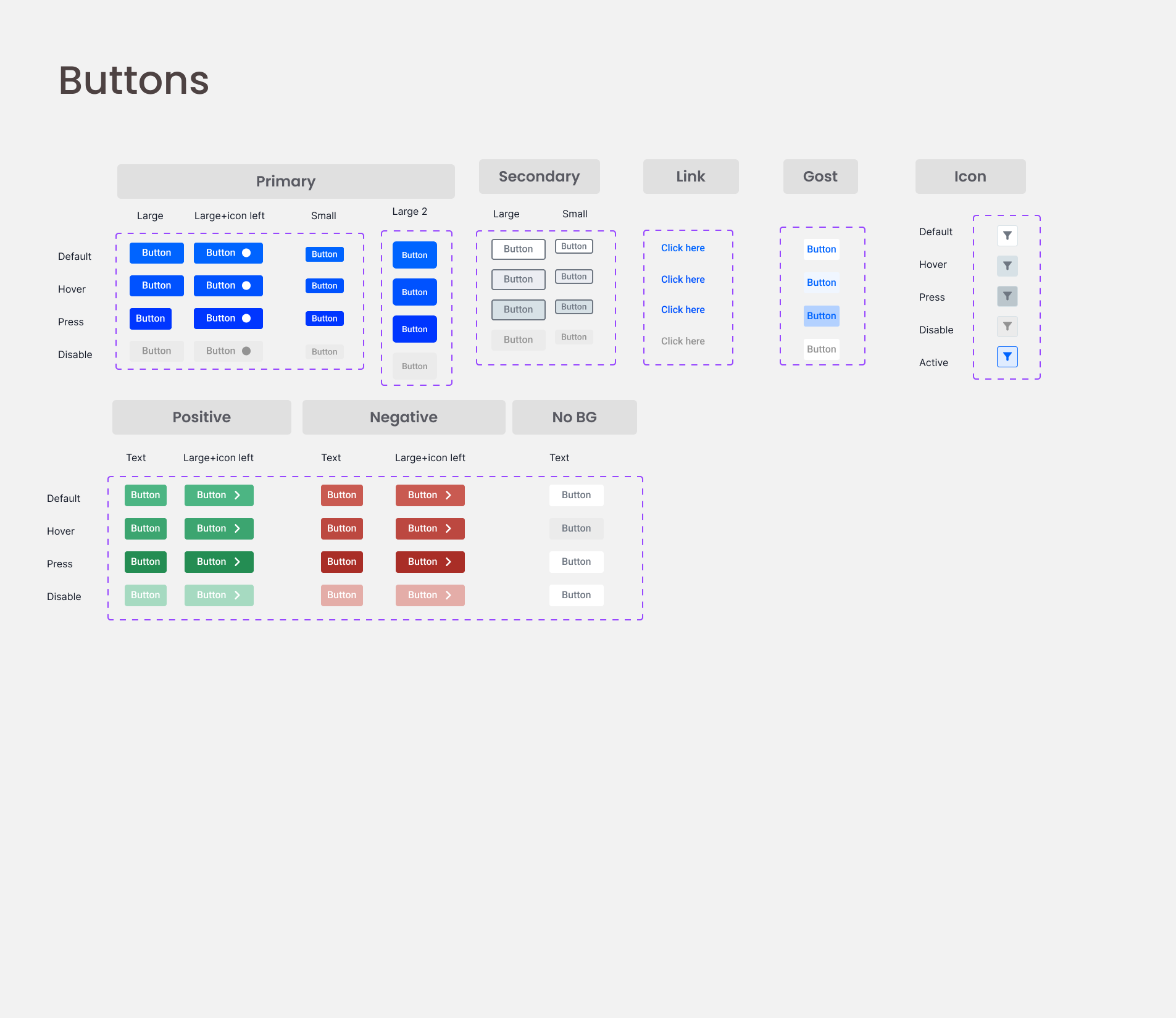
After: 1 tokenized component, 3 sizes, full coverage of product needs
Building with developers, not for them
A design system can't live in Figma alone. Weekly syncs with front-end developers aligned token naming conventions, component APIs, and implementation priorities, and changed the design work itself. Decisions that seemed purely aesthetic became architectural questions about scalability. The Figma library and codebase stayed in sync from day one.
Input text as a tokenized component example: every visual property wired to a design token
Solution
A tokenized component library built to scale alongside a product that couldn't stop shipping
Token-first architecture
Color, spacing, and typography defined as design tokens before any component. Every visual decision traceable to a variable, not a hardcoded value.
Progressive rollout
New features built on the DS from day one. Legacy screens migrated incrementally. No big-bang transition, no user disruption.
One source of truth
One Figma library, one token pipeline. Designers and developers working from the same component definitions. Handoff time dropped 40%.
Impact
What changed after rollout
-0%
Handoff Time
Reduction in design-to-development handoff time after DS rollout
0%
Accessibility
All components meet WCAG 2.1 AA contrast and interaction standards
0+
Design Tokens
Color, spacing, typography, and component tokens defined and documented
0x faster
Design Time / Screen
Fewer micro-decisions per screen. When the rules exist, design is faster to execute.
A shared language changes how a team works
The design system's impact wasn't only visual. New feature design started from existing components rather than new ones. Developers referenced token documentation instead of asking designers for color values. Handoff reviews shifted from pixel-checking to behavior verification.
The product still has legacy screens to migrate. The system is designed to make each migration mechanical: swap the component, validate states, ship. The remaining work is execution, not problem-solving.
Reflection
What this project taught me
What changes when the system exists
What changed first wasn't on screen. Designers and developers started using the same names for the same things. Handoffs shortened. Edge cases surfaced earlier. The system created a shared language before it created a shared library, and that turned out to be the more valuable half.
Next project
PhobEase
CBT exposure therapy + smartwatch biofeedback, designed around emotional safety