Clinical software designed around expert workflows
Role
Timeline
Team
Skills
Overview
NAOX Buds are EEG earbuds designed for clinical and research use. No companion software existed. I had to design one interface for four specialist profiles, each arriving at a different moment in the workflow, for an entirely different purpose.
My role
Sole designer on a 4-person team, building from scratch: no software, no design system, no legacy data. I took on PM tasks alongside the design work: roadmap, backlog, product decisions. Throughout, the hardware team kept shipping NAOX Buds updates. Adapting to new specs was part of the job.
Discover
The same tool, four completely different jobs
Starting from zero
The first challenge wasn't design. It was defining what I didn't know: how many distinct profiles existed, which ones were most underserved, and whether they shared any mental models at all.
Double Diamond over Lean UX: the problem space was too undefined to iterate on. Before testing anything, I needed the right questions.
Twelve interviews, one structural gap
The interviews turned up four distinct user profiles. But the real discovery was the gap between stated and observed needs.
What each specialist actually does
| EEG Technician | Clinical Researcher | EEG Analyst | Scientist | |
|---|---|---|---|---|
| Recording | ||||
| Data management | ||||
| EEG analysis | ||||
| User account management |
No single user owns the full workflow.
Define
Who uses what, and when
The full workflow, mapped across profiles
Each profile intersects the workflow at a different moment.
The research pointed to one structural problem: the interface applied the same cognitive mode to tasks with completely different demands. The fix was to split it into three distinct environments.
Design
From 14 controls at once to 4, per cognitive context
What the recording screen was missing
Chosen approach
Convention-matching recording controls: a redesigned start/stop with distinct visual weight, a dedicated signal quality indicator, and a recording timer.
Alternative rejected
Controls integrated into the surrounding interface aesthetic. Visually consistent, but indistinct from non-critical elements.
Cognitive principle
Cognitive tunneling: during a high-attention task, only the most visually salient elements capture attention. A start/stop recording control must match the user's existing mental model. It needs the visual weight of a consequential action.
Result
Configuration errors on the recording screen fell to zero in V2 testing, across all four user profiles.
Recording screen: V1 vs V2
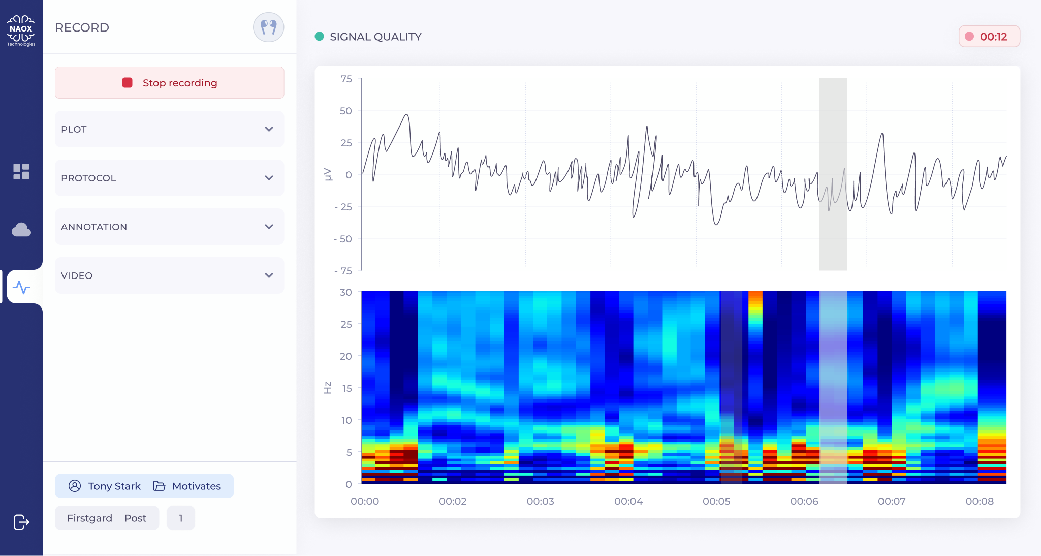
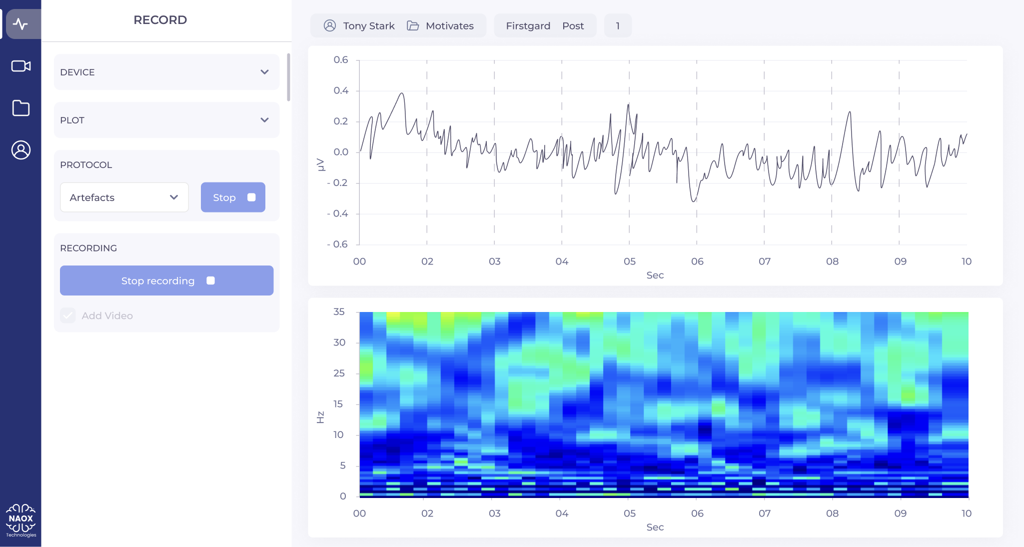
V1: signal quality not surfaced, start/stop buried, redundant time axis adding visual noise
V2: color-coded recording controls, signal quality status, NAOX Buds pairing, optimized EEG layout
AI Eye-tracking
Clueify analyses how users perceive and navigate the interface, without a participant panel. Heatmaps, overlooked zones, clarity scores per screen.
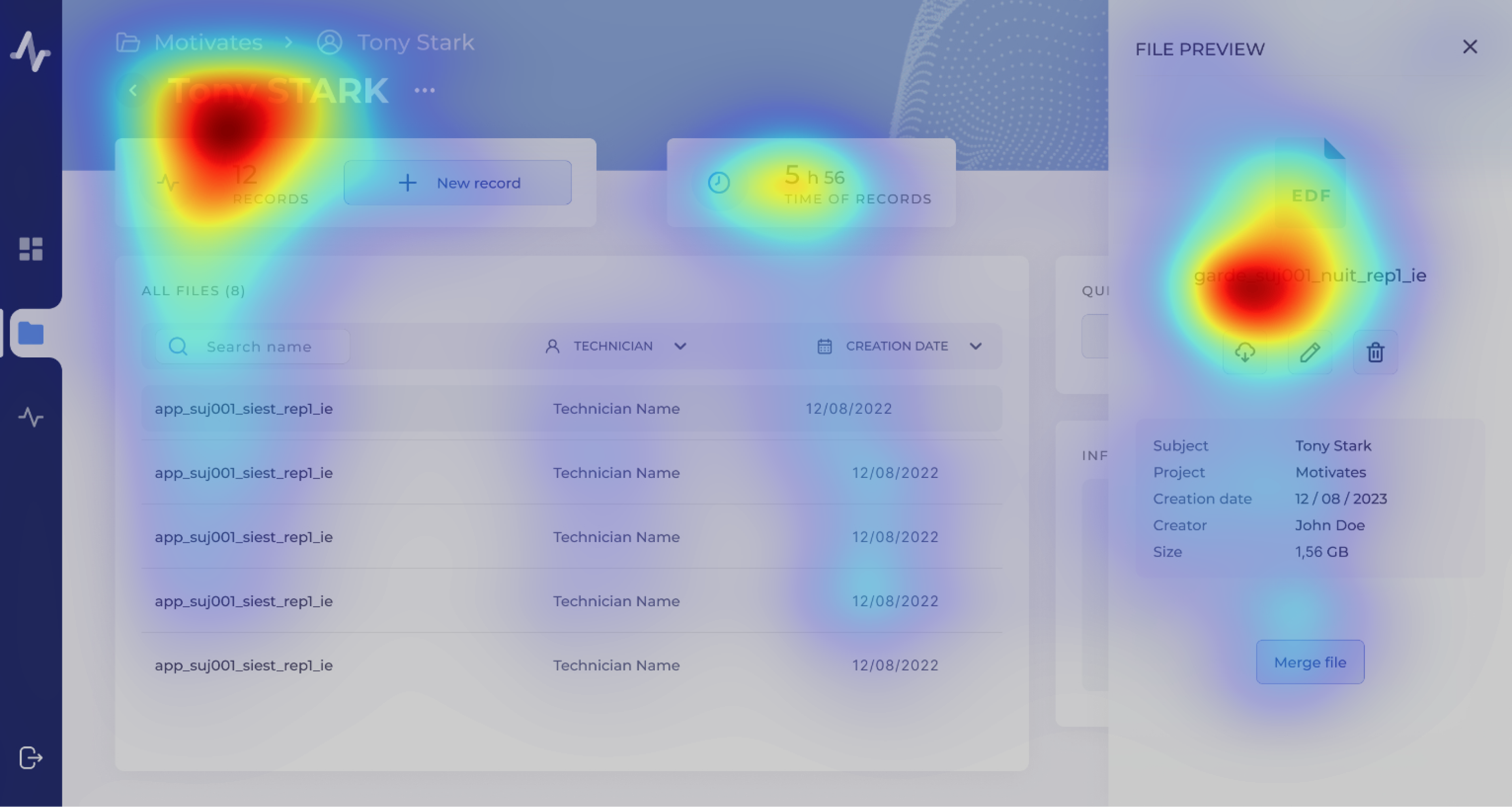
Clueify after redesign: attention now focused where it matters. Clarity score: 82%
Solution
Three context-aware screens, each designed for a distinct cognitive state
Starting a session
The launch flow removes all configuration that doesn't need to happen at that moment. One screen, one task.
Dashboard: orientation mode, 4 controls instead of 14+
Managing session data
Structured search and filters let users find any recording by patient, date, or protocol. Recognition over recall: no commands to memorize.
Data Management: structured around EEG session metadata
Recording without distraction
During acquisition, the interface shows only what matters: signal quality, electrode status, and stop. Every other control is hidden.
Recording interface: high-attention mode, 4 active controls, zero distractions
Impact
What a researcher with 8 years of EEG experience said
+0pts
Clarity Score
Clueify AI eye-tracking: 69% to 82% across core screens over 2 prototype iterations
-0%
Setup Time
Reduction in EEG session setup time, measured during moderated usability testing (n=6)
0/5
Ease of use
Average Likert score on post-test ease-of-use question, moderated usability testing (n=6)
0
Core Screens
Dashboard, Data Management, Recording: each designed for a distinct cognitive context
Reflection
What I learned
This was my first professional project as a product designer. Not a school exercise: real users, real constraints, a product that shipped. It's where I tested what I'd learned and found out what I still needed to build.
Next project
quarksUp
Designing an AI CV analysis feature for a B2B recruitment platform